It has been some time not updating my progress. Well, I'm actually working on the visual exploration. I experienced the difficulties and misery due to the limitation on my design skills. This is a problem that definitely can't be solved in short while. Time is needed to grow that skill. However, I have to move on with the progression and I did the best I could. A lot of conversations were done with myself to justify the visual elements that I was selecting. Whatever it is, let's see how far I have travelled.
1. Using the brush stroke effect as guided by Alex. Colour choice was criticized as having big association with communism ideology.
/
/
/
/
/
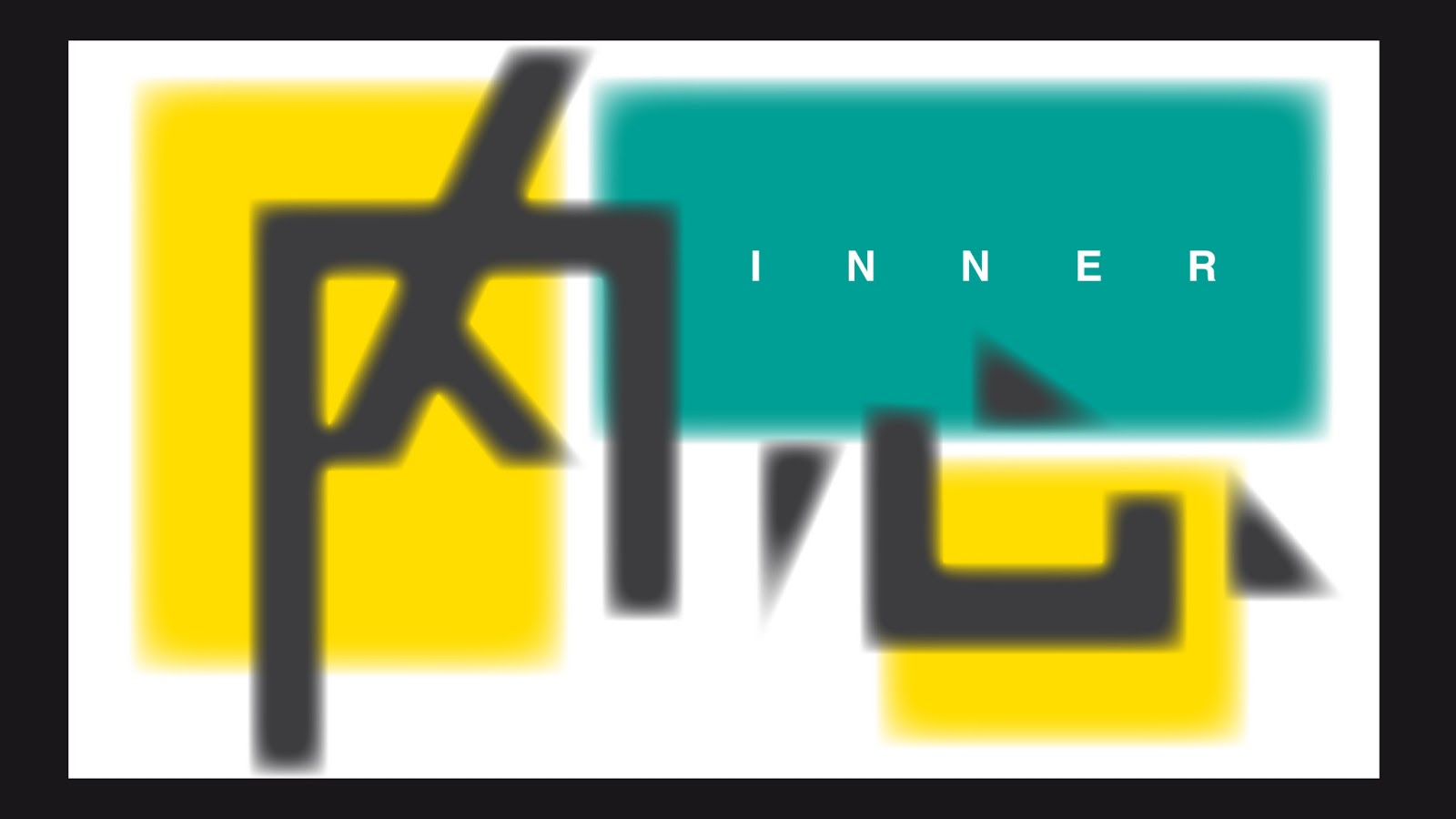
2. Choosing the right colour. Discovered that warm colour is more suitable to represent the massive voices.
/
/
3. Experimenting with watercolour effect with several colours.
/
/
/
Looks like a sky?
/
4. Nailing down basic colours and layouts to work with the watercolour effect. I've also tried to replace the "dots" in the Chinese character with strokes to unify the visual expression with the bold grey strokes.
/
Vertical stroke is bold to get a balance with the horizontal stroke.
/
/
/
/
/
/
/
/
/
5. Expanding watercolour effect to other media.
/
/
/
/
/
6. I find something not right here. Watercolour effect is too soft to represent the massive voices created by the society. Also, I think I could work better with the Chinese characters. In the end, I discovered it is because the construction of the characters are not unified under a system, hence they look disconnected.
/
/
/
/
Working out a system to connect all of the voices.
/
7. With all the adjustments and experimentations above, displayed below are the final visuals at this stage. It came into my mind that the boxes/ blocks at the background are limiting the expression of voices where it should be given with more freedom. Hence , I used the brush splashing technique to give social voices a stronger character. Besides that, I also rewrote the paragraph describing about this project (in the video) so that it sounds more humane.
/
/
/
/
/
/
/
/
/
8. As for the design of the ball sculpture's outer layer, I am planning to coat a layer of paint as foundation. Then, the letters printed on vinyl sticker will be pasted onto the surface. The only issue to be solved is to check with the printer whether vinyl sticker is attachable with clay and acrylic surface. Here are some useful sources about vinyl sticker:
Honestly, I know I can't be spending more time at this stage of visual exploration because time is running short. Within the one month duration, I have to get every technical procedure settled. This includes the video production, making the ball sculpture and the pedestals. Anyhow, I hope things will be doing good. I just have to stay with a clear piece of mind to know how I could progress from here.
This is the
fifth batch of design, where I’ve gathered the feedbacks of my classmates and
Alex from the previous design. Few points are noted:
Redesigned
typography does not work when the characters are assembled into words. Specific
reasons unidentified.
Combination
of red and dark grey colour scheme gives a relation of communism ideology.
Tone
of design should be a little lively.
Chinese
characters should be dominating the English words.
Hence,
according to the opinions, the new batch of design is created.
Poster/ Batch 4
Card (front)/ Batch 4
Card (back)/ Batch 4
Video No.1/ Batch 5
Video No.2/ Batch 5
Video No.3/ Batch 5
Video No.4/ Batch 5
Video No.5/ Batch 5
Video No.6/ Batch 5
Video No.7/ Batch 5
Video No.8/ Batch 5
However, I
am not satisfied with this design yet. I understand that my design skills in
communicating with visuals are not matured yet. Looking back to all the designs
that I have made, coming to this 5th batch, I have not shown very
strong mastery in the area of visual narration. I observed I have come to a
point where things are not going very well because I couldn’t progress much when
working with the visuals. Hopefully, there is a solution for me to come out
from this situation soon.
Every step is
part of the progression. I am learning, I am learning, I am learning.